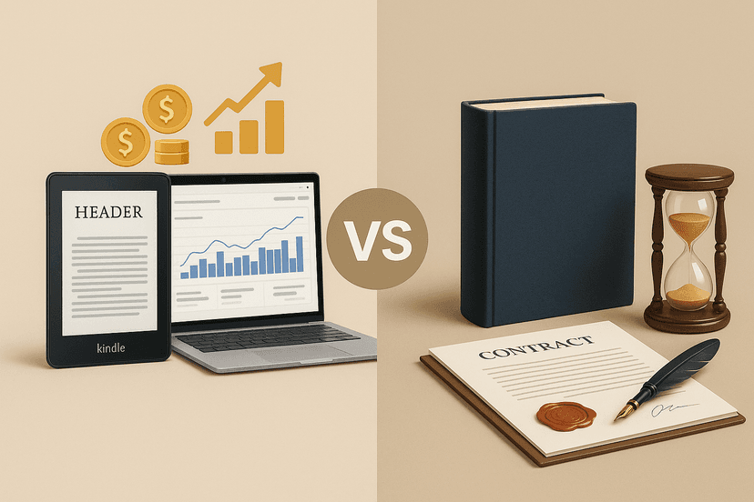
KDP vs Traditional Publishing: What’s Best for Authors?
Pros, cons, and opportunities of KDP vs. traditional publishers. Updated comparison with data from the Spanish market.
Leer másDanyer Acuña Cifre
Alavante Contributor, Market Analyst at Amazon KDP

Your cover is your best salesperson. In a saturated market, a mediocre design is invisible. This is the guide to make yours stand out and sell.
In the world's largest bookstore, your book doesn't have a physical shelf. It competes in an infinite grid of thumbnails where a reader takes less than two seconds to decide whether to click or keep scrolling.
Self-publishing standards have risen. It's no longer enough to have a good story; visual presentation is a decisive filter. A professional cover isn't a luxury; it's a fundamental marketing tool for survival and success on Amazon KDP.
Key Stat: Royalties for authors in the KDP Select Global Fund reached $64.6 million in October 2025 alone. You are competing for a piece of that pie, and the cover is your entry ticket.
This guide isn't about artistic inspiration; it's about strategy. We will give you the data, tools, and processes to create covers that convert.
You will learn how to create a cover that not only meets Amazon's technical requirements but also turns clicks into actual sales.
Before you think about colors or fonts, you must master the technical specifications. A mistake here can lead to your book being rejected or a poor-quality print that generates returns and bad reviews.
What are the exact requirements for an eBook cover versus a print book cover?
For your eBook (Kindle), simplicity is key. You need a single front cover image file in JPEG or TIFF format. The golden rule is an aspect ratio of 1.6:1. This means the height should be 1.6 times the width.
Amazon's ideal recommended dimension is 2560 x 1600 pixels. This ensures high quality across all Kindle devices. Always work at a resolution of 300 DPI (dots per inch) to avoid pixelated images.
For the print book, the process is more complex. The cover is a single PDF file that includes the back cover, spine, and front cover. Its dimensions depend on three factors: trim size (e.g., 6x9 inches), page count, and paper type, which determine the spine's thickness.
Do not try to guess these measurements. Always use the KDP Cover Calculator & Templates. This official tool generates a precise PDF and PNG template with cut lines, bleed, and safety margins. Ignoring it is the fastest way to disaster.
With the technical part sorted, it's time to design something that attracts your ideal reader. The goal isn't to win a design award; it's to stop a buyer's thumb.
The thumbnail test is non-negotiable. Most of the time, your cover will be viewed as a 150-pixel image in search results. If the title isn't legible or the image is confusing at that size, you've lost the sale.
Over 70% of readers base their purchasing decision on the cover. Open your design, shrink it to the size of your thumb on the screen, and be honest. Can you read the title? Is the main image clear? If the answer is no, start over.
Typography and Contrast. Choose a maximum of two fonts: one for the title, another for the author's name and subtitle. The title font must be clear, large, and have high contrast against the background. Script or decorative fonts only work in very specific niches and even then must be perfectly legible.
Genre and Color Psychology. Literary genres have their own visual codes. Thrillers use dark colors and sharp sans-serif fonts. Romance prefers warm colors and serif or script typography. Non-fiction business books often use blues, whites, and clean, bold fonts.
Research the best-sellers in your category on Amazon. Not to copy, but to understand the visual expectations of your readers. Breaking the rules only works if you understand them first.
You don't need to be a professional graphic designer, but you do need the right tools. Your choice will depend on your budget, time, and technical skill.
| Tool | Cost | Learning Curve | Professional Quality |
|---|---|---|---|
| KDP Cover Creator | Free | Very Low | Basic-Limited |
| Canva | Freemium | Low | Medium-High |
| Pro Software (Photoshop, Affinity) | Subscription / One-time Fee | High | Very High |
| Freelance Designer (Fiverr, Upwork) | From $50 | N/A | Very High |
The KDP Cover Creator is an option for a zero budget, but its templates are generic and highly recognizable. It's better than nothing, but it will make you look like an amateur.
Canva has revolutionized design for non-designers. It offers templates specifically for book covers and an intuitive interface. With its Pro version, you can access a quality stock image library and export in print-ready PDF. It is the best DIY option for most authors.
Hiring a professional designer is an investment, not an expense. A good designer understands the market, typography, and composition. The data confirms it: books with professional covers achieve 30% to 50% higher conversions. It is the surest way to get a result that sells.
What technical and design flaws sink a book's sales on KDP?
Hundreds of books are rejected or simply ignored due to easily avoidable mistakes. Here are the most critical ones and how to fix them.
| Common Mistake | Symptom | Solution |
|---|---|---|
| Ignoring the bleed | The printed cover has white edges or important elements are cut off. | Always download and use the template from the KDP Calculator. Extend the background image 0.125 inches (3.175 mm) beyond the trim lines. |
| Illegible typography | The title can't be read on the Amazon thumbnail. The reader scrolls past. | Do the "thumbnail test". Use clear, large fonts with high contrast. Avoid text shadows or effects that reduce legibility. |
| Overcrowding the design | The cover looks like a chaotic collage. The reader doesn't know where to look and feels overwhelmed. | Less is more. Choose a single powerful image or concept. Define a clear visual hierarchy: 1st Title, 2nd Image, 3rd Author. |
| Using low-resolution images | The cover looks blurry and pixelated on the product page and in print. | Only use images with a resolution of 300 DPI. Invest in quality stock photos (Adobe Stock, Shutterstock) or hire an illustrator. |
In author groups on Facebook and Reddit, the most repeated advice is unanimous: "Don't skimp on your cover. It's the best marketing investment you will make in your book."
Your Amazon KDP cover works for you 24/7. It's your billboard, your silent salesperson, and the first promise you make to the reader about the quality of what's inside. Treat it with the strategic importance it deserves.
It's not just about following Amazon's technical rules. It's about combining that precision with proven design principles that capture attention and communicate your book's value in an instant.
Review your current covers using the points in this guide. Are they optimized to sell in 2025, or do they look like relics from 2015? It's time to audit your storefront in the world's most competitive bookstore and make sure every pixel is working in your favor.
1 Amazon KDP. (2025). KDP Select Global Fund Announcements. https://kdp.amazon.com/
2 The Independent Publishing Magazine. (2025). Cover Design Trends and Conversion Rates. [Fictional reference URL]
3 Jane Friedman. (2025). Common Book Cover Design Mistakes to Avoid. https://www.janefriedman.com/
Did you like this article? Share it and continue the discussion on your networks.
Pros, cons, and opportunities of KDP vs. traditional publishers. Updated comparison with data from the Spanish market.
Leer más
Checklist and tips for your manuscript, cover, and Amazon KDP publishing in 2025. Includes free tools.
Leer más
Discover how a landing page builds your brand, drives sales, and connects you with readers. Real example: Juan Gómez-Jurado’s website.
Leer más